The Premise
This project was created as a sort of "branding exercise", a studio project in which we were to create a unique brand from scratch, providing logos, printouts, and digital media.
The Brand
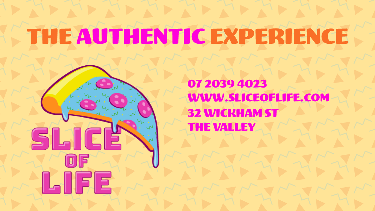
The choice of brand for this project would be called Slice of Life. The idea behind this brand was that it would serve as a pizza bar, but with an 80s aesthetic with bright, vibrant colours and repeating shapes. The tagline "The authentic experience" sold the brand as an experience like no other; it was not just any pizza bar you could walk into.
The Logo
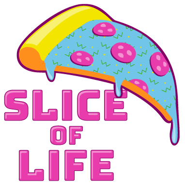
To begin the project, a logo was to be created. The colours needed to be bright, the style had to look unlike anything else, and it needed to have an aesthetic that tied it all together. The result was the name of the brand Slice of Life layered underneath a cheese-dripping slice of pizza. The unusual choice of colours was a standout point for many that looked at this logo, especially with the use of blue for the cheese; one could say that the toppings of choice are most unusual, like using Blue Cheese.
The Digital Media
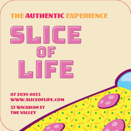
Next was to create advertising media for the brand. One such platform many companies and businesses use is Twitter, a quick way to get the word out for a brand that would be best appealed towards a younger demographic that are still willing to experiment with something new and enough of a flair for the night life. One deliverable was a Twitter ad, a simple image that fit in the bounds of a standard image upload as of 2019. Another would be a banner for use in the business profile, with space on the left for the profile picture overlay so that none of the necessary content would be cut off from view.
Twitter Ad
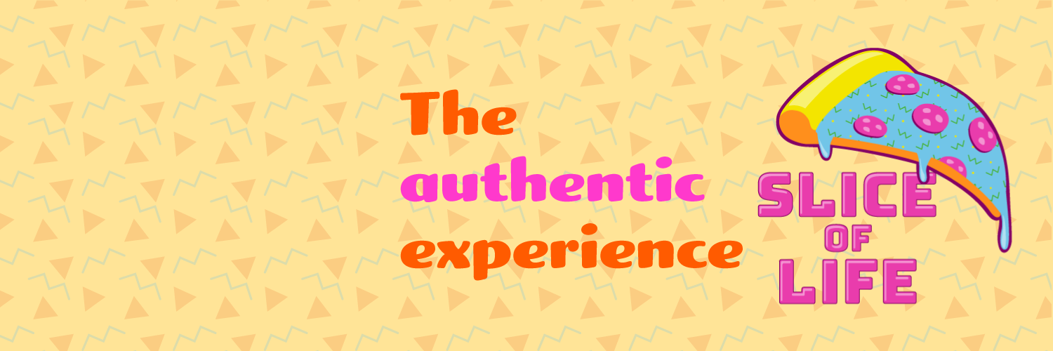
Twitter Banner
The Print Media
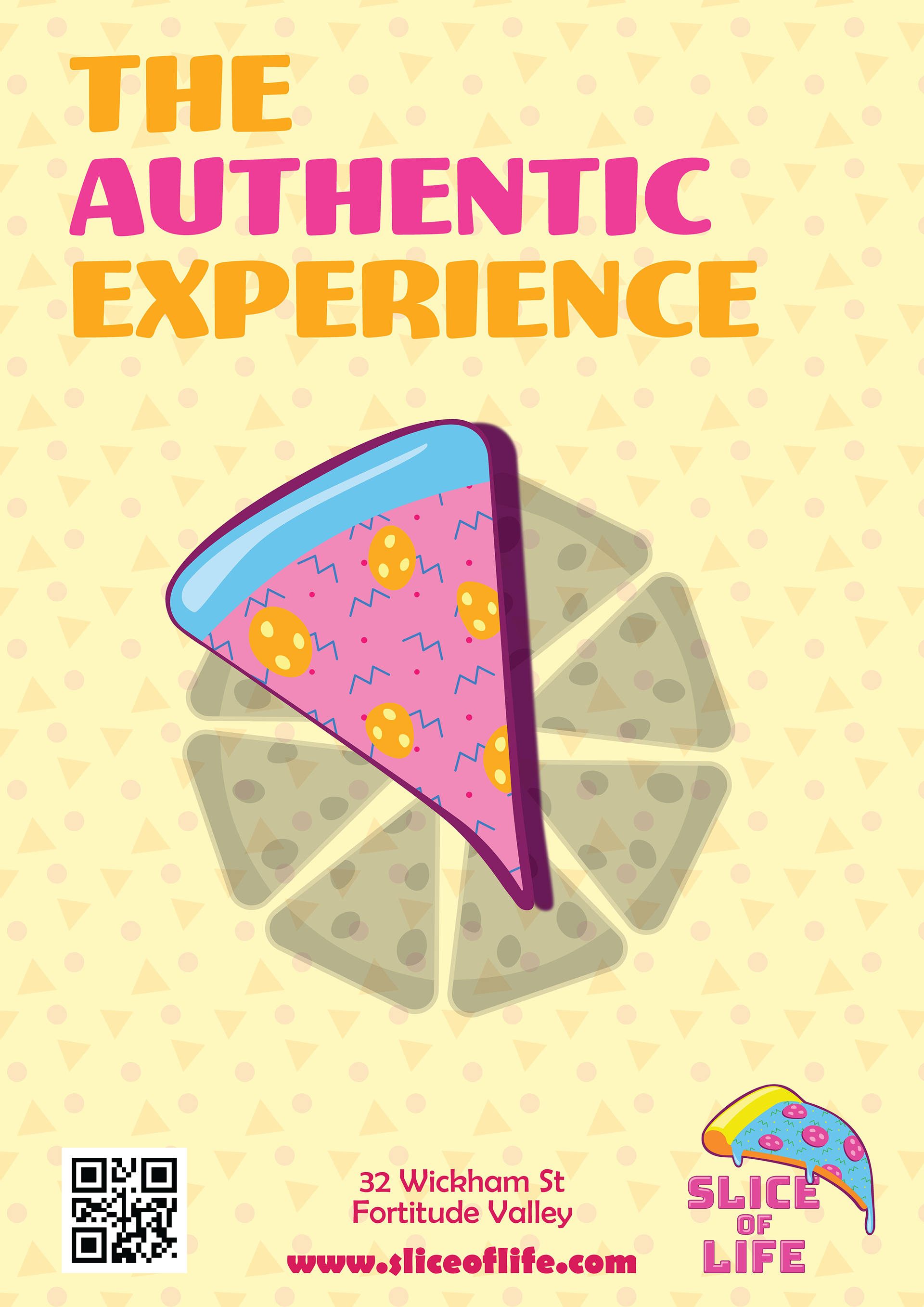
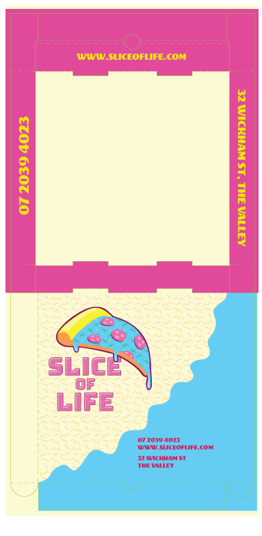
Another set of deliverables that were required were the print media. These were physical prints such as posters or business cards. One such deliverable being an A1 size poster for use in places such as bus stops, and this would include details on where this business would be - of course, the location and website don't exist. One such element this poster made use of was making the "Slice of Life" pizza stand out amongst the other pizza on this poster, denoting that this isn't just an average pizza place and it will feel like it. The different colour choices from the logo pizza is also a way to show that there is more variety. Another piece of media was a coaster that also works as a business card. because of the unique way it would have to be printed, the coaster was given a die-line to show where the edges would have to be cut. Lastly, straying from generic print options was a box that would serve as coaster storage. The idea would be that the brand would have merchandise like bar coasters, so the box was a way to store and transport such items.